← All work
CASEBetclic · B2C gaming · Online poker · Desktop

Keeping high-value players against the competition

Four design priorities locked before opening the new desktop app to a wider audience.
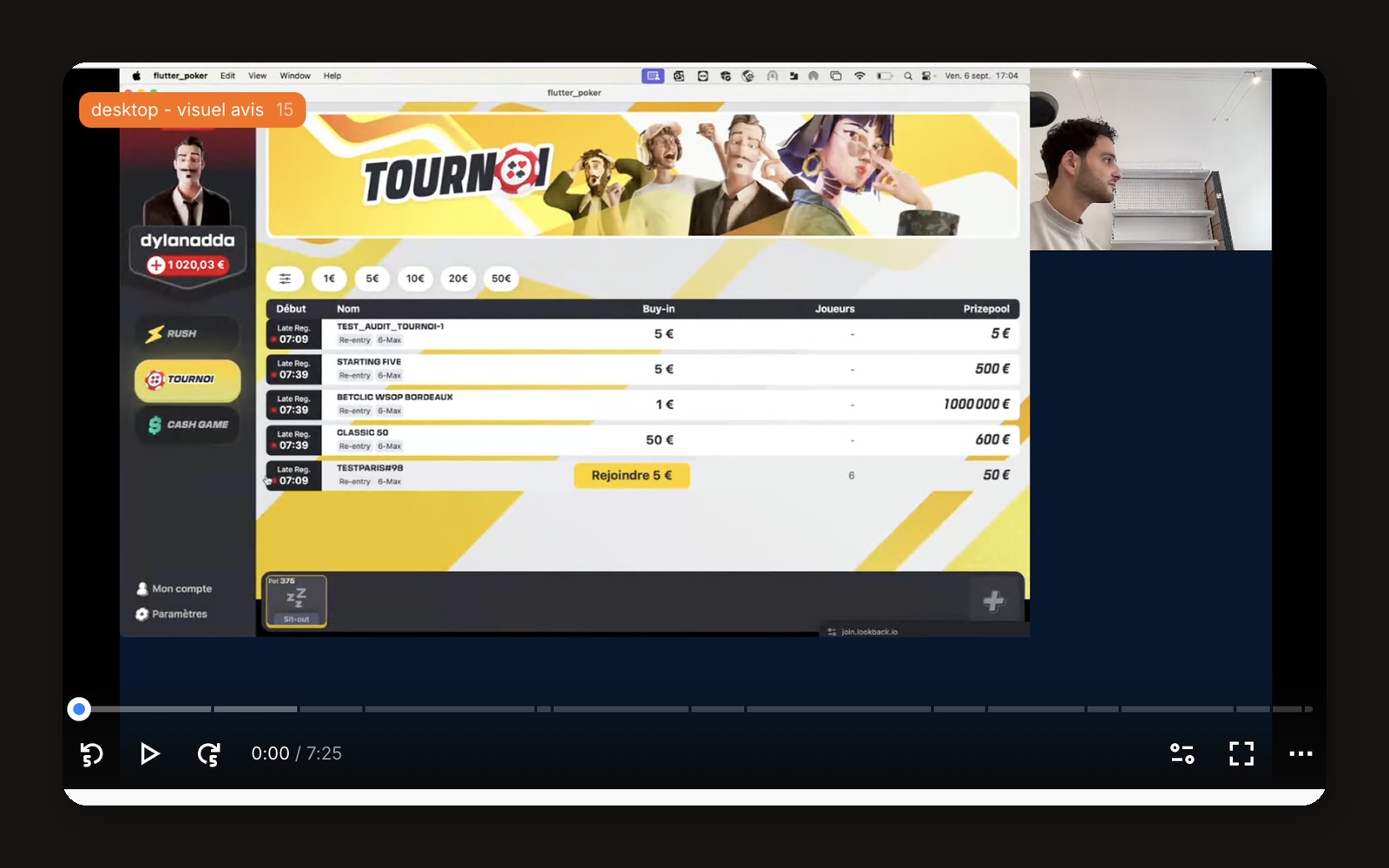
Betclic: Keeping high-value players against the competition
Role
Prototype testing and design priorities for v2
Team
Poker squad: PM, designers, developers
Scope
New poker desktop app, first external test
Duration
Sept 2024
What I did
Test protocol, Figma prototype review, moderated sessions on Lookback, design recommendations and prioritisation with the PM.
found decision time too short
5/5
priorities before v2
4
The problem

The new poker desktop app was about to open to a wider audience. Its first external users were exactly the high-stakes regulars Betclic could not afford to lose to competitors.

Research

How I went to the field.

  1. 01

    Protocol and recruiting

    Recruited 5 high-stakes regulars (cash game, Twister, MTT), Betclic customers or not, aged 21 to 50.

  2. 02

    Moderated sessions

    Moderated 1:1 sessions on Lookback, screen and camera, on the desktop app 1.0.4: navigation, expectations, confusion, engagement.

  3. 03

    Synthesis

    Verbatims grouped by theme, then prioritised by frequency and impact.

What we learned

What the field told us.

01

Game speed leaves no time to think.

Players could not observe opponents or make their decision in time.

“It goes very, very, very fast, that’s true.”Cash game player, 50
02

Multi-tabling is unmanageable without a mosaic view.

The “+” button to add a table stayed hidden without active exploration.

03

Tournament info is unreachable mid-game.

Players left, blind levels, payout structure: the same gap came up 4 times.

Design

From evidence to screens.

  1. 04

    Prototype review

    Reviewed the Figma prototype against what experts did in the sessions: speed, multi-tabling, tournament info.

  2. 05

    Design recommendations

    Turned each friction into a design change: longer default timer, mosaic view, always-visible add-table button, tournament info at the table.

  3. 06

    Prioritised v2

    Locked 4 priorities with the PM before opening the app to a wider audience, and kept the “video game” identity players loved.

Key design decisions

What I chose, and what it cost.

01

Longer default decision time

Options
Keep the fast pace · or slow the default and let experts speed up
Trade-off
Slightly slower tables for casual players
Choice
A longer default decision timer.
02

A mosaic view for multi-tabling

Options
Tabs · or tiled tables
Trade-off
Smaller tables on small screens
Choice
A mosaic view and an always-visible “add table” button.
03

Keep the “video game” identity

Options
Align on competitors’ classic look · or keep the bold visual identity
Trade-off
Less familiar for players coming from other rooms
Choice
Keep it: players saw it as a real differentiator.
Outcome

v2 was prioritised on expert players’ expectations before launch, instead of discovering these frictions after it.