01
Users could not see what the tool gave them.
The home screen was a planning grid: a chore, not a reason to come back.
“I come on Tuesdays because I assume my team is there. But I don’t really know.”User, client company
Redesigned the first session around people and events instead of a schedule.
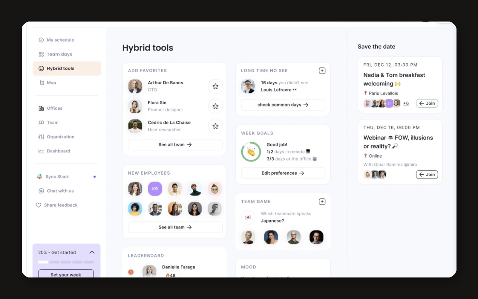
After Y Combinator, at.Café onboarded ~300 new users a week, but 55% never came back after planning their first week. The home screen showed a weekly planning grid with no immediate value.
Moderated interviews with users who stopped coming back, to understand why the first week did not stick.
A 5-question survey after the first login (~50 answers a week) that also recruited the next interviewees.
The home screen was a planning grid: a chore, not a reason to come back.
“I come on Tuesdays because I assume my team is there. But I don’t really know.”User, client company
Rolled out by leadership, configured by managers and HR: one more task to fill in.
In hybrid work, people from the same company did not know each other despite shared interests. Connections and events made them come in.
“We met by chance at the coffee machine. That’s where the real conversations happen.”User, client company
Card sorting on the social features to find what users expected to see first.
Prototypes of the social features tested with users, iterating on what they understood and used.
The home rebuilt around colleagues, company events and interest clubs; planning a month in a few clicks.
User tests of the new version before it shipped to every client company.
The new version was tested with users before rollout. After the redesign, new-user churn dropped from 55% to 32%.